🤔What's The Problem?
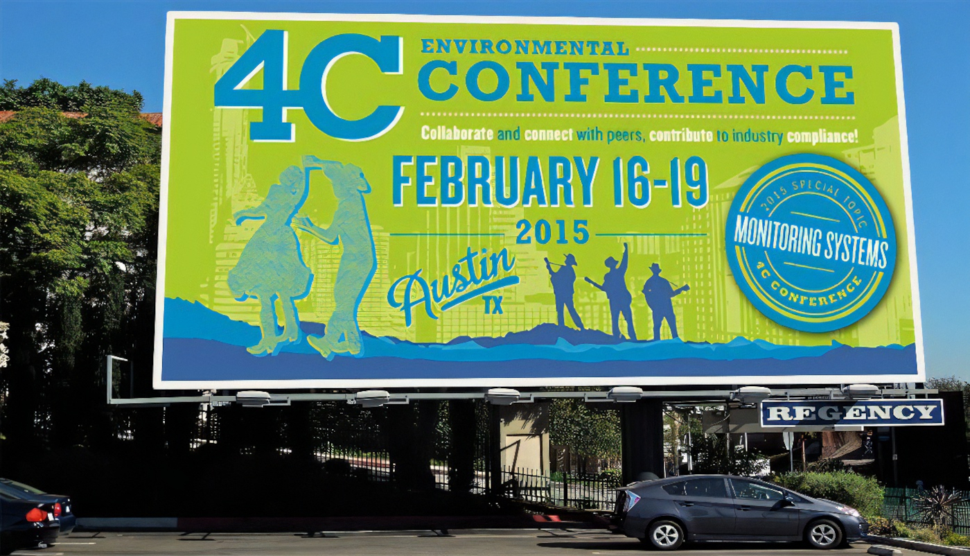
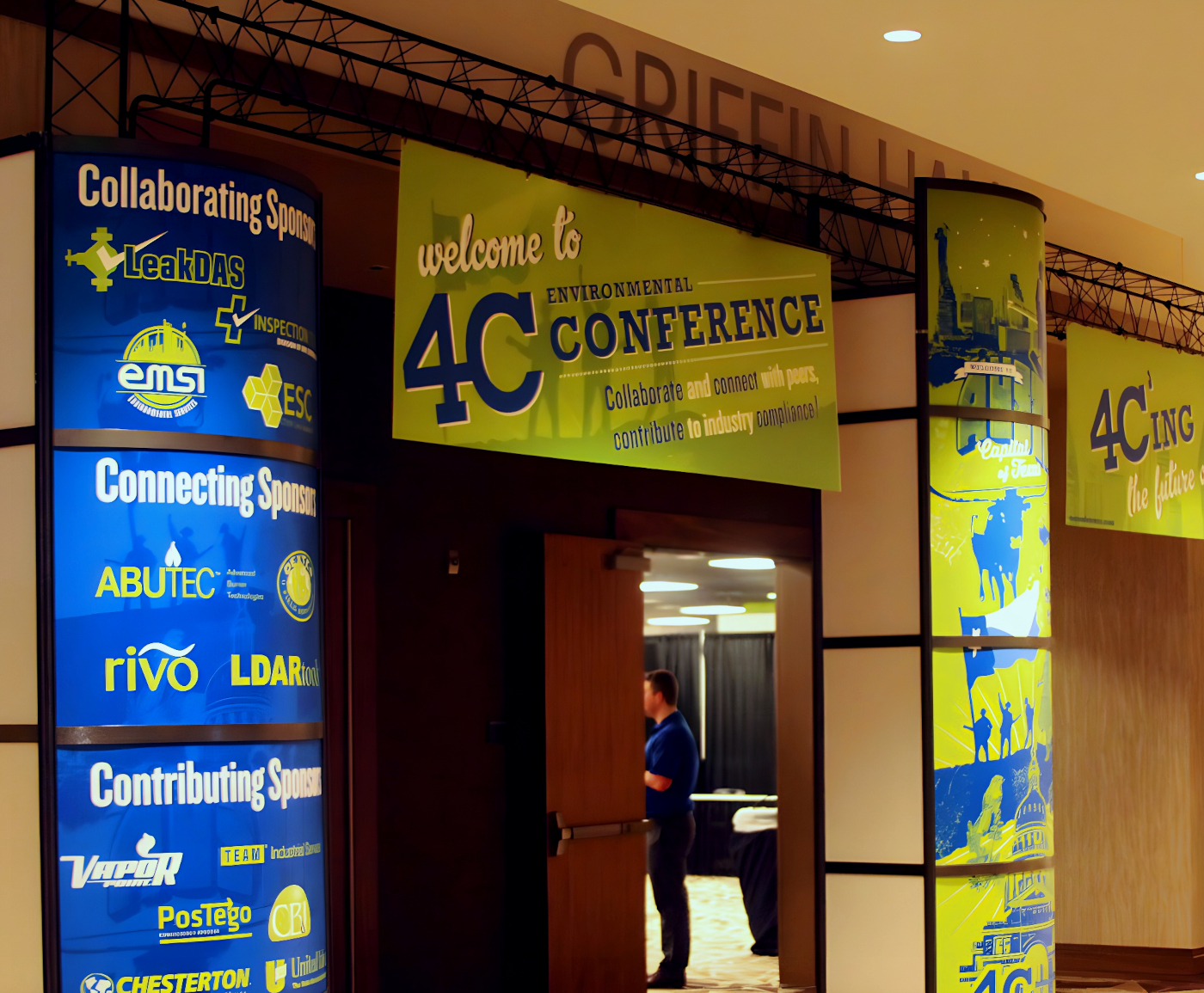
In 2015, the 4C Conference saw unprecedented growth, resulting in a need for larger spaces for accommodations, workshops, and entertainment. However, the company didn't scale the branding accordingly. Gorgeous but small signs sat in tiny spaces. There was a lack of wayfinding that helped people explain where the workshops, classes, and activities were. This left attendees struggling to navigate without their program papers, causing frustration and confusion.
Post-conference reflections highlighted the disconnect between the 2014 and 2015 experiences. Previously, it was still intimate enough to be considered rooms that needed decoration. But no one anticipated that by next year, it would be elevated into a true expo experience for clients. For 2016, our focus was on improving this aspect to ensure success and enhance overall attendee satisfaction.
When we started planning for the next conference, it was clear that this wasn't just about aesthetics anymore. Instead of asking "Which font looks prettiest?", it felt better to ask "Can people see this font at this size across the room?" Rather than plan for our familiar small 18 x 24 signs on podiums, we turned our sights to booths, tents, and exhibition displays. As an intern at the time, this challenge was both terrifying and thrilling, and I was about to learn a lot in regards to how people interact with what designers create.
Laying the Groundwork📐
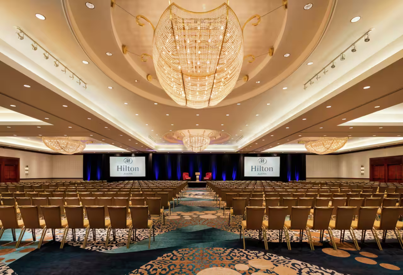
We started not on a computer, but "out in the field" so to speak. Once we knew the Grand Hyatt would host the conference, we organized multiple discovery sessions. This hotel had a large entryway and multiple floors, increasing both the volume of people and the space to manage, requiring meticulous planning. It was indeed an increase in scope, not just in people volume but room to work.
Asking for floorplans of the hotel, we decided to take a literal walk in the shoes of someone who would be attending the conference. When you started at the entryway, the check-in area was easy enough to navigate. But what after that? It was a large main lobby, with many different choices to make. It felt clear to us that we needed booths for assistants to offer our paper programs and answer questions. But what about once you got a good night's rest and came down the main elevators to the lobby? Turns out, the space near those elevators was perfect for putting large directory boards, showing the floor plans and which rooms had what to offer. As we walked, we identified key locations for information booths, large directory boards, and other signage. It became clear that creating something beautiful was often the easiest part, while practicality was crucial.
🔍Research Findings
Walking the halls and experiencing the space firsthand was critical. If hallways got too confusing, we'd mark it down as a place to put wayfinding. Large index signs at hallway entrances guided attendees to their destinations, improving foot traffic. Colleagues from different departments provided additional perspectives on their ideas of pain points...or areas of opportunity!
By the time we got back to our computer, we still weren't ready to make things pretty. Instead, our focus was on detailed inventory checklists, categorizing signs by size, type, and location. We also mapped out everything on the hotel blueprints, ensuring we had a solid foundation.With a complete inventory of what, where, and why, we then tackled the how, making our strategy robust and actionable.
Usually, our branding of the conference was always in-house. However, this year our designers focused on logistics, while contract designers handled the overall look and feel. This division of labor allowed us to delve deeply into planning without the pressure of finalizing aesthetics before the big weekend.It was a collaborative effort that played to everyone's strengths and made sure every detail had the proper attention given to it.


The Results🎉
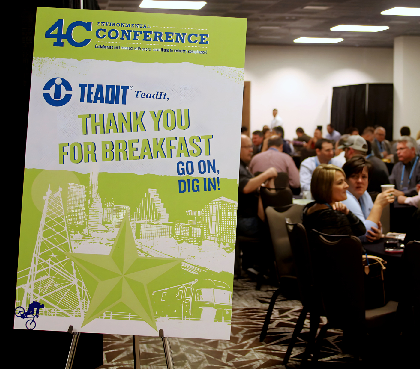
With thorough planning and volunteers staffing information kiosks, issues regarding people getting lost or overwhelmed were minimalized. People arrived at their classes on time, and additional activities were easy to find, ensuring a smooth experience. With the grander scale of signage and the cohesive walkthrough to most places, it added to an immersive experience that just wasn't achieved before.
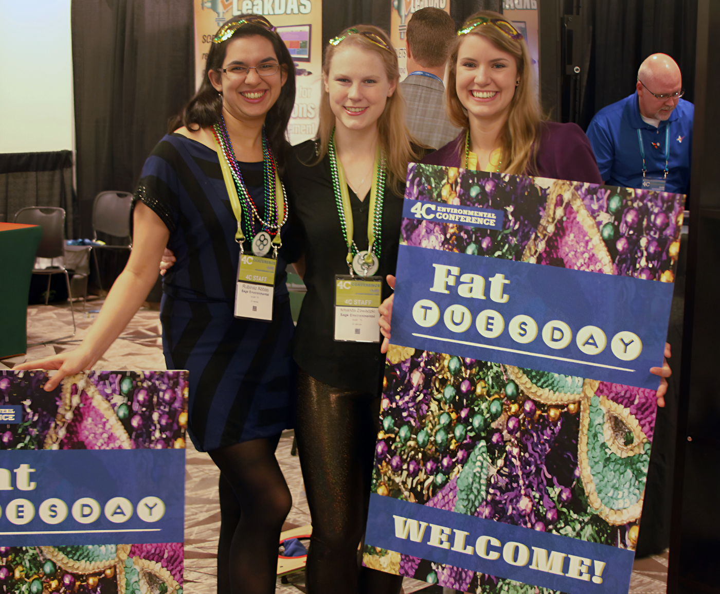
By the time it was over, guests were thrilled and had a great time. Post-conference surveys and analytics showed an uptick in positive experiences, with more attendees eager to return. The CEO recognized our efforts as a significant improvement, validating our hard work. Overall, it was a huge success for our team, setting a new standard for future conferences.
🎓Big Takeaways
While I didn't realize it in the thick of the project, coming out from the other side made me realize this was my first taste of what user experience meant. It wasn't just about creating beautiful designs but focusing on the people and understanding their needs and challenges.For the first time, I had to think critically about the bigger picture. While getting details about the why of a project before designing wasn't new to me, the scale we had to dilute to emphasize the importance of research and planning in design, especially when it comes to large-scale projects.
I'm extremely grateful to have gotten that exposure so early in my career. I feel like it made me more sensitive to the broader implications of graphic design. One of my favorite ways to describe graphic design is "It's art with a purpose: to connect a goal to a human." I wouldn't have truly appreciated how many moving pieces can affect that goal, and how looking from a human perspective is vital. That's why this is a project I am still proud of all these years later.