The online university is in need of a better study partner request flow, so students can get the help they need. We will make a responsive website that gives the tools needed for students to find study partners, but also offers the welcoming vibe of a social media community.
Lead UX Designer - Wireframing, Prototyping
UX Researcher - User Testing, Analysis
Graphics - UI Designing
The age of the internet has given universities a lot more power when it comes to how to approach classwork and studying. Information can be shared immediately and remotely, which can be beneficial for those who can't attend school physically.
In fact, the Online University of Austin has no brick-and-mortar locations; and the way they approach an online-only classroom setting works well for their students. But, there are some drawbacks, and the major concern was there was not enough second-hand help if there were students struggling. Many of the students surveyed were unsatisfied with the additional source materials or lack of help from teachers or aides. With how convenient online schooling can be, it does have drawbacks.
So what's the solution? To implement a study partner request flow, but to treat the portal more like a social hub than an academic hub. This would give students the tools needed for finding study partners, but also offer the welcoming vibe of an online community.
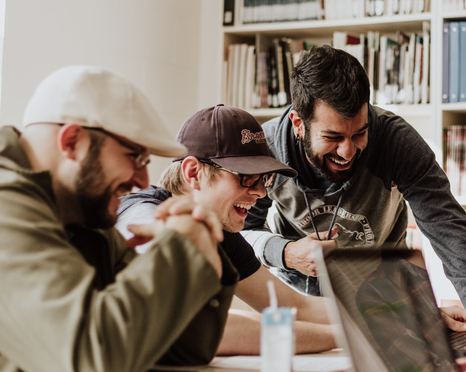
Students want the power to be able to meet in study groups, and the University thinks this is a great idea. Studies show that strong benefits from study groups are a better understanding of subject materials, gaining well-rounded insight from other perspectives, maintaining personal responsibilities, and more.
There are a broad range of people that attend college classes despite what pop culture might imply. There are of course those just coming from high school but the older generation as well from all sorts of backgrounds and cultures want continuing education. That is why I wanted to reach out to as many different groups as possible, to see what unique goals and pain points they encounter on a day-to-day basis, especially when schooling is done online.
When asked how they felt about having a study group portal structured like social media, many participants were eager with the idea. They wanted to be able to curate their own help in a casual setting.

But there were some pain points to consider. Some of the older study participants had their worries and frustrations with technology; they wanted a UI that could be navigated with ease regardless of tech smarts.
Other students who had courses that required critique from their peers were worried about giving and getting honest feedback. They are afraid of emotions interfering despite these projects needing critique, both positive and negative.
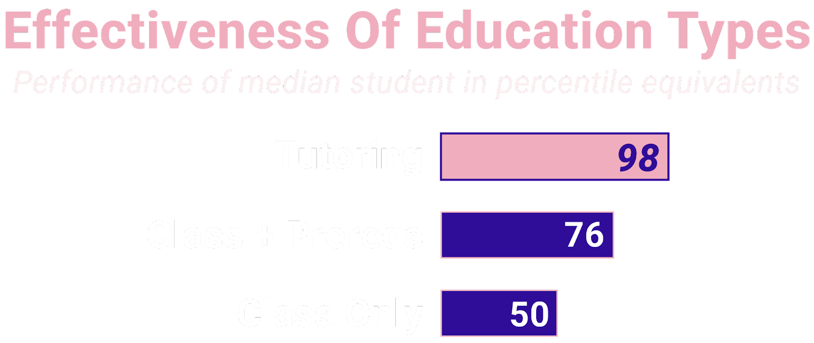
And then of course there were some in particular not confident in their study skills. They were curious about the possibility of tutoring assistance as well, in case the casual help was not enough. This encouraged us to encourage students that enjoy tutoring to apply as one of these more certified users.
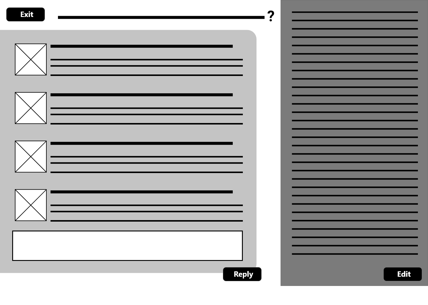
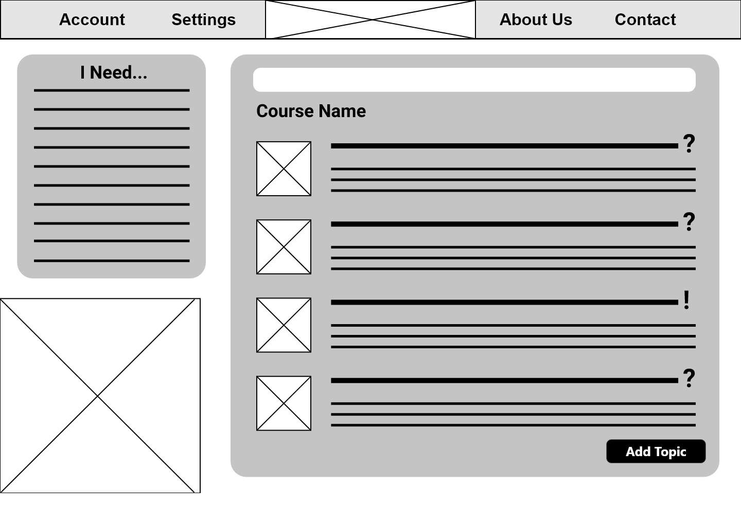
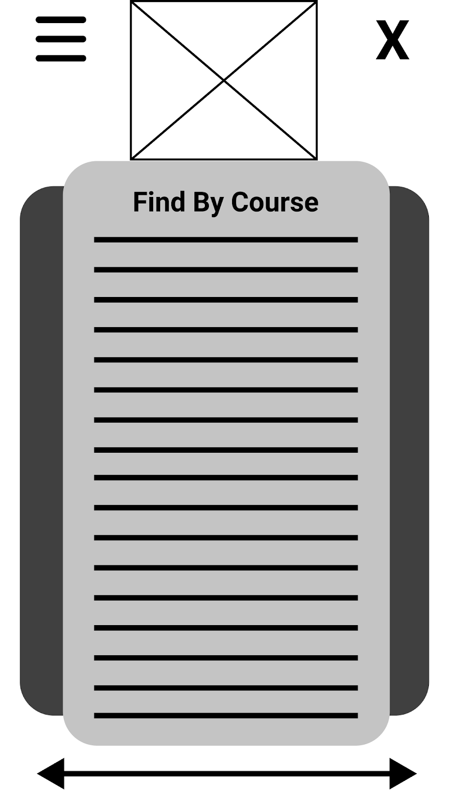
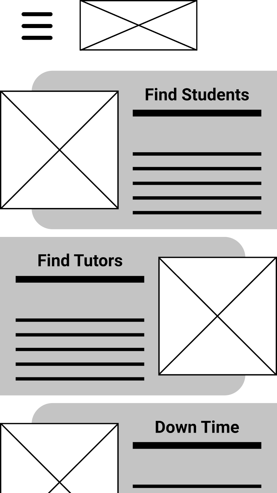
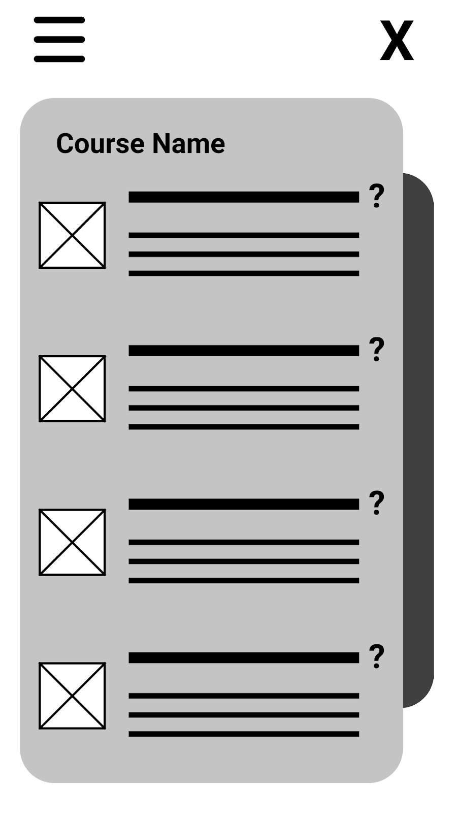
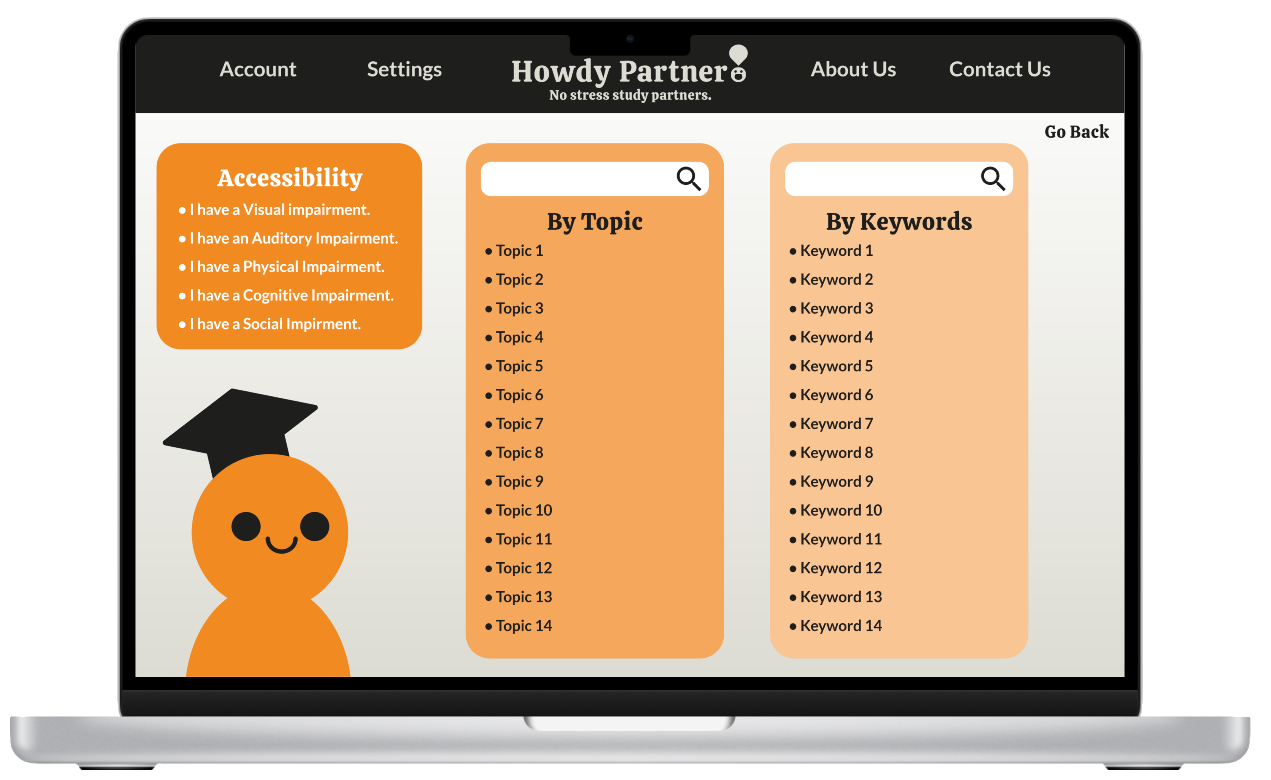
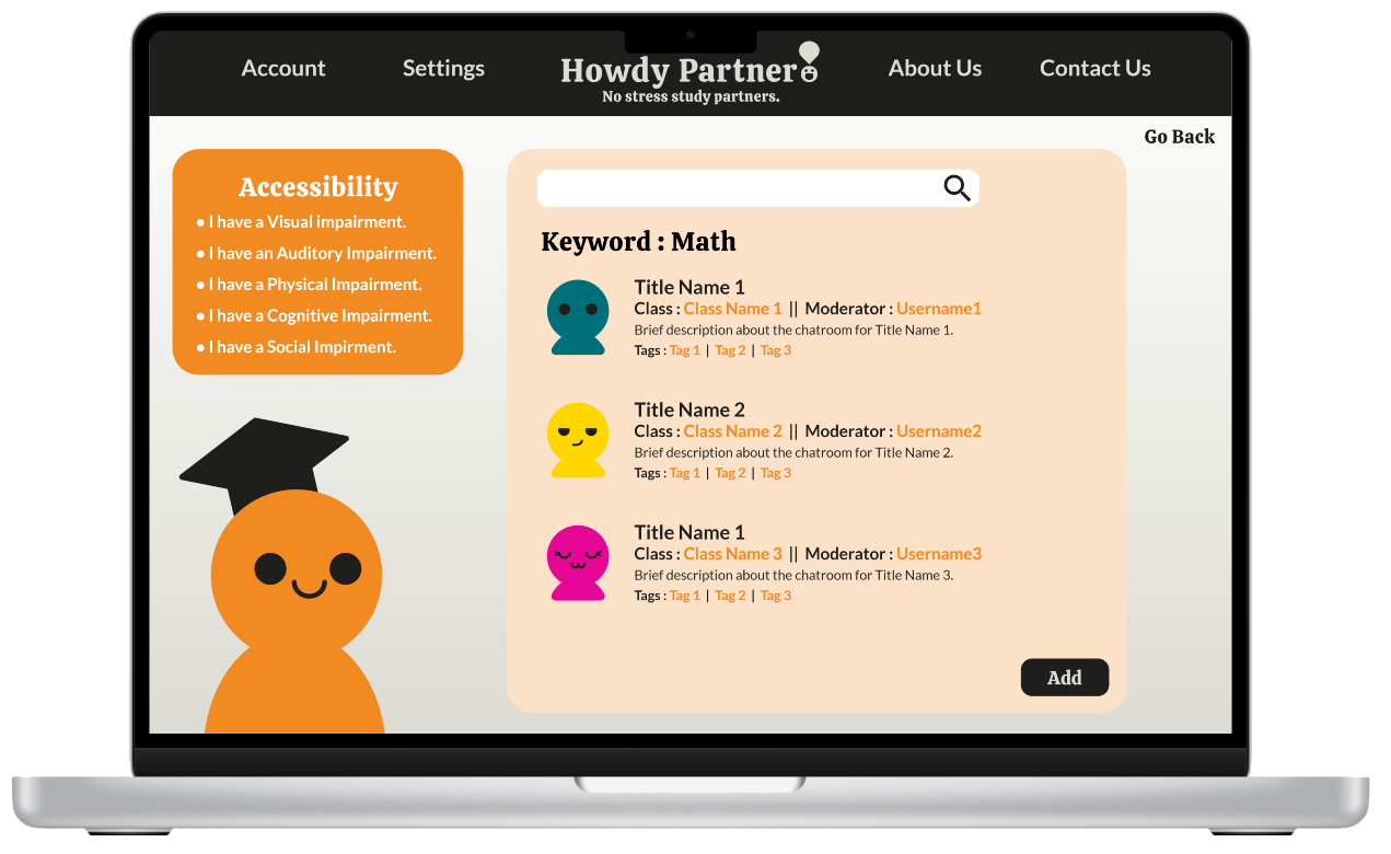
I wanted categories of how to find the type of help you need to be clear and clean. No wondering where to go or how to get the specific group of people or information best suited for your current needs. As you navigate through the different categories, more detailed areas will come up for a better, curated experience. It was also important that accessibility was always upfront and center; along with specific user settings that can be applied to your account, each topic section had a small navigational tool to assist with any specific disabilities that needed to be addressed.
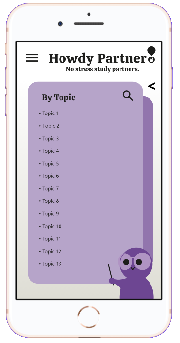
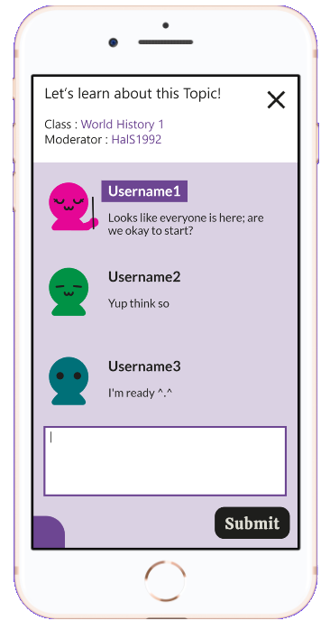
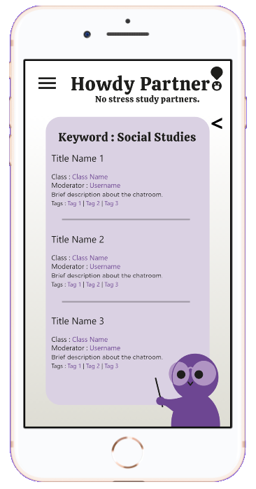
For the mobile version, I wanted the look to stay the same but in a condensed form; that way the UI will be familiar no matter what platform you use. Navigation flow was kept the same but in a condensed space for easier viewing on the smaller screens.
For the low-fidelity prototypes, adjustments were mostly made on the structure so that sections were a bit clearer and easier to identify. The high-fidelity feedback helped with a lot of small detail-focused changes to help with the overall look and feel of the designs coming together in a cleaner, clearer brand.
Once the platform was opened, enrollment was initially about 17% of the total college roster signed up. But after the year-long campaign and integration process, this number increased to 72%, and feedback has been hugely positive. There is also a clear sign that this study portal is helping, as grades have increased across all areas of study by 6%.
Students also report having a sense of fulfillment when helping fellow classmates. A few have reported they wish to keep in touch after graduating and continuing to be a part of the mentorship program. There is a lot that goes into a social media site so the work isn't done yet. I think what I’ve provided is a solid foundation in which to expand but I know there is so much more intricacy that needs to go into such a network.